How to Audit Your SaaS Pricing Page (6-Attribute Framework)
A practical 6-attribute scoring framework for auditing SaaS pricing pages, with a real Airtable worked example showing exactly how to evaluate tier names, prices, descriptions, billing periods, seats, and features against competitors.

Most SaaS pricing pages get built once and touched rarely. A founder picks some round numbers, writes a few bullet points, and moves on. Meanwhile, competitors shift their pricing, new players enter the market, and what used to be a strong pricing page quietly becomes a liability.
The problem isn't that founders don't care about pricing. It's that they lack a repeatable way to evaluate it. "Does our pricing look good?" is a feeling. "Our Business tier scores 4.7/10 on price perception against five competitors" is a signal you can act on.
Why Most Pricing Reviews Fail
Before walking through the framework, it helps to understand why ad-hoc pricing reviews don't work.
☒ Most founders set pricing once and forget it. They pick a number that "feels right" during launch and never revisit it with data.
☒ Competitive analysis is usually a one-time exercise. Teams might check competitor pricing before launch, but rarely track how it shifts over time.
☒ Pricing decisions happen in a data vacuum. Without scoring against specific attributes, it's impossible to know whether your pricing page is strong, weak, or just average.
After the 2025 SaaS price surge, where major platforms raised prices 20-40% across the board, regular pricing audits aren't optional anymore. Your competitors are moving. Your pricing page needs to keep up.
In a great market -- a market with lots of real potential customers -- the market pulls product out of the startup.
And the market also pulls pricing in specific directions. A structured audit helps you see where the market is pulling yours.
The 6-Attribute Pricing Audit Framework
This framework evaluates each pricing tier across six attributes, scored 0-10 relative to matched competitors in your category. The key word is relative. A $99/month price isn't inherently good or bad. It depends on what competitors charge for similar value.
Here's what each attribute measures:
| Attribute | What It Scores | Why It Matters |
|---|---|---|
| Name | Clarity, differentiation, ladder coherence | Confusing tier names create friction before buyers even see the price |
| Price | Competitive position, value alignment, psychological pricing | The single biggest conversion lever on your pricing page |
| Description | Value articulation, keyword strategy, readability | Tells buyers whether this tier is for them in 2-3 seconds |
| Period | Billing model options, annual discounts, risk-reduction signals | Monthly vs. annual framing affects both conversion and retention |
| Seats | Segment fit, messaging clarity, flexibility | Per-seat pricing confusion kills deals, especially for larger teams |
| Features | Parity coverage, differentiators, ladder delineation | Features justify price jumps between tiers and prevent downgrades |
How scoring works:
- Each attribute is scored 0-10 using a rubric normalized to your competitor set
- Tier Score = mean of the six attribute scores for that tier
- Product Score = mean of all tier scores
This means a perfect 10 doesn't mean "best possible." It means "best in your competitive set." And a low score doesn't mean your pricing is broken. It means competitors are doing something specific that you're not.
A Real Audit: Airtable's Pricing Page
Theory is useful. Worked examples are better. Let's walk through a real audit of Airtable's pricing using this framework.
We scored Airtable's four tiers (Free, Team at $24/mo, Business at $54/mo, Enterprise Scale at custom pricing) against five matched competitors: NocoDB, Grist, Retable, Baserow, and SeaTable.
Airtable Tier-by-Tier Audit Results
| Tier | Score | Strongest Attribute | Weakest Attribute |
|---|---|---|---|
| Free | 7.9/10 | Price (8.8) | Features (7.0) |
| Team ($24/mo) | 7.9/10 | Features (10.0) | Price (6.3) |
| Business ($54/mo) | 7.4/10 | Features (10.0) | Price (4.7) |
| Enterprise Scale | 6.9/10 | Features (10.0) | Price (4.0) |
Overall Product Score: 7.5/10
The pattern is immediately visible: Airtable's features are best-in-class (10/10 on three paid tiers), but price perception drops sharply on higher tiers. The Business tier at $54/mo scores just 4.7/10 on price. That's a red flag.
Let's break down what each attribute revealed.
⦿ Attribute 1: Tier Name (Airtable: 7.5-8.5 range)
The Name attribute scores how clearly each tier communicates who it's for, how it differentiates from adjacent tiers, and whether the naming ladder makes sense.
Airtable's names (Free, Team, Business, Enterprise Scale) scored well. They follow the Good-Better-Best pattern that buyers expect. "Team" immediately signals collaboration. "Business" signals governance and scale. No confusion.
Where names go wrong:
- Generic names like "Pro" or "Premium" that don't tell buyers who the tier is for
- Naming that breaks the ladder (e.g., "Starter" then "Growth" then "Team" creates confusion)
- Missing descriptors that force buyers to read feature lists to understand tier differences
What to check in your audit: Read your tier names without looking at features or prices. Can a buyer immediately understand the progression?
⦿ Attribute 2: Price (Airtable: 4.0-8.8 range)
Price scoring is the most impactful attribute and the most nuanced. It evaluates competitive position, value-metric alignment, psychological pricing tactics, and step-up ratios between tiers.
Airtable's Free tier scored 8.8/10 on price. That's expected. Free is hard to beat.
But the Business tier scored just 4.7/10. Why? At $54/mo per editor, it's 2.25x the Team tier ($24/mo). Meanwhile, NocoDB Business costs $24/mo with unlimited seats, and SeaTable Enterprise is $14/mo. Airtable's features justify a premium, but the price perception score says buyers feel the gap.
The Enterprise Scale tier scored even lower at 4.0/10, largely because there's no visible price. Hidden enterprise pricing removes the anchoring effect that makes mid-tier plans feel like better value.
What to check in your audit:
- Calculate the step-up ratio between each adjacent tier. Jumps above 2x need strong feature justification
- Compare your prices to matched competitor tiers, not the market average
- Look for psychological pricing signals (charm pricing like $49 vs. round numbers like $50)
⦿ Attribute 3: Description (Airtable: 7.5-8.1 range)
The Description attribute evaluates how well each tier articulates its value in a few words. Good descriptions answer three questions: Who is this for? What's the key benefit? Why upgrade from the tier below?
Airtable's descriptions scored in the 7.5-8.1 range. They communicate target personas clearly ("For teams building apps to collaborate on shared workflows") but miss some opportunities for keyword-rich language that would help with SEO and AI discoverability.
What to check in your audit:
- Does each description mention the target persona?
- Can a buyer understand tier value in under 3 seconds?
- Do descriptions create a natural upgrade path (each tier should make the one below feel limiting)?
⦿ Attribute 4: Billing Period (Airtable: 5.0-8.5 range)
The Period attribute scores billing model options, annual discount messaging, and risk-reduction signals like free trials or money-back guarantees.
Airtable's paid tiers scored well here (8.0-8.5) thanks to a 16.7% annual discount, which sits right near the 17-20% sweet spot that pricing research recommends. The Free tier's period scored 8.0 because it's clearly ongoing with no time limit.
The Enterprise Scale tier dragged at 5.0/10 because it shows "N/A" for period. That ambiguity creates friction. Enterprise buyers need to know they're looking at annual contracts.
What to check in your audit:
- Is your annual discount in the 17-20% range?
- Do you default to showing annual pricing (anchors the lower number)?
- Do free tiers clearly communicate "free forever" vs. "free trial"?
⦿ Attribute 5: Seats (Airtable: 5.5-8.0 range)
The Seats attribute scores how well your seat model fits your target persona, whether messaging is clear, and how you compare to competitors.
Airtable's Free tier scored 8.0/10 on seats (up to 5 editors, reasonable for individuals). But the paid tiers scored 6.5/10 because competitors like NocoDB and Retable offer unlimited seats at lower prices, making Airtable's per-editor model feel restrictive for cross-functional teams.
What to check in your audit:
- Is your seat model clearly explained on the pricing page?
- Do you distinguish between "users" and "editors" or "viewers"?
- How do your seat limits compare to matched competitor tiers?
⦿ Attribute 6: Features (Airtable: 7.0-10.0 range)
The Features attribute scores parity coverage (do you match competitor basics?), differentiators (what's unique to your tier?), and ladder delineation (do features clearly justify upgrading?).
This is where Airtable dominates. Three of four tiers scored a perfect 10/10 on features. The Team tier's jump from Free is massive: 50x more records (1,000 to 50,000), 250x more automation runs (100 to 25,000), 30x more AI credits, and advanced views. That feature gap creates a strong upgrade trigger.
The Free tier scored 7.0/10. It's functional but deliberately limited. Those limits (1,000 records, 100 automations, 1 GB storage) are the exact friction points that push users to Team.
What to check in your audit:
- Do your feature lists highlight what's unique to each tier (not just what's included)?
- Are upgrade triggers clear (what runs out first on the lower tier)?
- Do your premium features match what competitors gate at the same tier level?
Putting the Scores Together
Here's what Airtable's full scoring matrix looks like:
| Attribute | Free | Team | Business | Enterprise |
|---|---|---|---|---|
| Name | 8.0 | 8.0 | 7.5 | 8.5 |
| Price | 8.8 | 6.3 | 4.7 | 4.0 |
| Description | 7.5 | 8.0 | 7.8 | 8.1 |
| Period | 8.0 | 8.5 | 8.0 | 5.0 |
| Seats | 8.0 | 6.5 | 6.5 | 5.5 |
| Features | 7.0 | 10.0 | 10.0 | 10.0 |
| Tier Score | 7.9 | 7.9 | 7.4 | 6.9 |
Product Score: 7.5/10
The audit reveals a clear story: Airtable has the best features in its competitive set but pays a price perception penalty on premium tiers. The Business tier's 4.7/10 price score is the biggest opportunity. It means buyers are comparing $54/mo against NocoDB at $24/mo and SeaTable at $14/mo and feeling the gap, even though Airtable's features justify the premium.
This is exactly the kind of insight that's invisible without a structured scoring framework. "Our pricing feels high" becomes "our Business tier scores 4.7/10 on price relative to five competitors, specifically because the 2.25x step-up from Team lacks sufficient psychological anchoring."
How to Run This Audit Yourself
You can run this framework manually. Here's the process:
⦿ Step 1: Identify 3-5 direct competitors. Not aspirational competitors. Companies your buyers actually compare you against. If you need help finding them, competitive pricing analysis tools can automate discovery.
⦿ Step 2: Match tiers across competitors. Your "Pro" tier might map to a competitor's "Team" tier. Match based on features and target persona, not price or name.
⦿ Step 3: Score each attribute 0-10. For each tier, evaluate all six attributes relative to the matched competitor tiers. A score of 5 means average. Below 5 means competitors are doing it better. Above 7 means you're ahead.
⦿ Step 4: Calculate tier and product scores. Average the six attribute scores per tier. Then average all tier scores for your product score.
⦿ Step 5: Identify patterns. Look for attributes that consistently score low across tiers (systemic issue) or tiers that drag down your product score (tier-specific issue).
The manual approach works but takes 4-6 hours for a thorough audit. We built this exact framework into Tierly's analysis engine so you can get scored results in minutes instead of days.
Get an instant score on any SaaS pricing page using this 6-attribute framework. See how your pricing stacks up. No signup required.
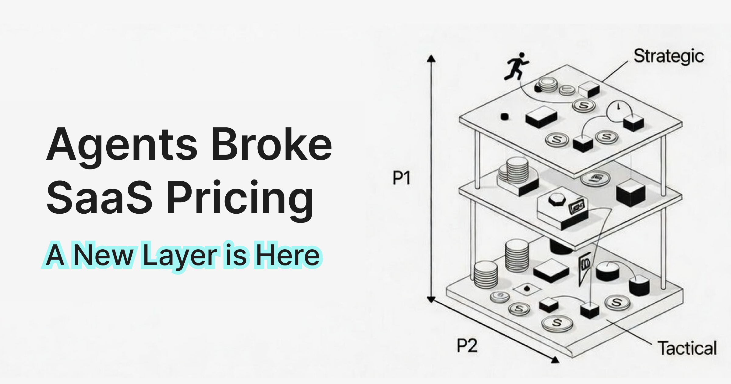
What This Framework Doesn't Cover (Yet)
This 6-attribute framework is tactical. It scores what's visible on your pricing page. But pricing strategy has a deeper layer that this audit doesn't capture:
- Pricing architecture: Is your tier count right? Are fences between tiers strong enough?
- Value metric fit: Are you charging per seat when you should charge per usage?
- Pricing psychology: Are you using anchoring, charm pricing, and decoy effects?
- Persona-tier mapping: Does each tier serve a distinct buyer persona?
- Competitive positioning: Are you premium, value, or budget vs. your market?
These are strategic dimensions that complement the tactical audit. In our next post, we'll cover the 5 strategic pricing dimensions that give you the full picture. (Tierly now scores both layers and combines them into a single Combined Score.)
FAQ
How often should you audit SaaS pricing?
What is a good pricing page score?
Can I audit my pricing page without competitor data?
What's the most important attribute to optimize first?
Turn Gut Feeling into Scoring Data
Pricing pages are too important to evaluate by instinct alone. The 6-attribute framework gives you a repeatable way to score, compare, and improve your pricing against real competitors.
The Airtable audit showed exactly this: best-in-class features (10/10) masking a price perception problem (4.7/10) that only becomes visible when you score systematically. Without the framework, you'd look at Airtable's pricing page and think "seems solid." With it, you can see exactly where the opportunities are and make decisions backed by data.
Deep dive into Airtable's pricing strategy with Tierly scores, competitor comparisons, and 4 strategic lessons for founders.
Compare the top tools for competitive pricing analysis, from manual research to AI-powered platforms.
How Notion's pricing strategy scores against competitors and the lessons every SaaS founder can apply.
Related Posts

What is Competitive Pricing? A SaaS Founder's Guide (2026)
Competitive pricing is the most common starting point for SaaS founders, but most get it wrong. This guide covers what competitive pricing actually means in SaaS, when it works, when it backfires, and how to use competitor data without letting it dictate your strategy.
SaaS Pricing Analysis: How Dual-Layer Scoring Works
A worked example of dual-layer pricing analysis using Intercom's real data. See how tactical scoring (6 attributes) and strategic assessment (5 dimensions) combine into a single score that reveals what neither layer catches alone.

Competitive Pricing Strategy: Complete SaaS Guide (2026)
A practical guide to competitive pricing strategy for SaaS founders. Learn frameworks, avoid common mistakes, and build pricing that wins deals.